Quarter 4, 2014
Protecting Your Business Chequeing Account:
Tips from the Better Business Bureau
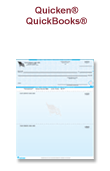
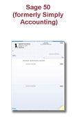
A big necessity for most businesses is a corporate chequeing account. Whether you use it for payroll, paying bills or ordering goods and supplies, your account is critical for operations and needs to be protected at all times.
Over the last few years, companies that print business cheques have added many new security features that can protect your business from cheque fraudsters who steal or reproduce cheque. These features include:
- Foil Holograms with 3-D, multi-coloured designs that can’t be reproduced by copiers and scanners
- Watermarks and visible fibers that embed security in the paper itself
- Multi-tonal pantographs that cause the word "void" to appear on cheques and other aspects of the cheque to disappear if it is copied
- Complex background patterns that deter "cut-and-paste" alterations
-
Micro-printed backs, faces and borders which are nearly impossible to reproduce with most printers

But these security features aren't available on every cheque out there. So the Better Business Bureau (BBB) recommends you pay a little extra when ordering cheques to take full advantage of the latest in fraud protection.
Guarding against fraud is critical, because most banks don't offer the same fraud protection available to personal account holders, leaving you, as a business owner, even more vulnerable.
Because much banking is now done online, the BBB also recommends that you regularly monitor account balances and keep computer virus protection and firewalls up-to-date.
The BBB also offers the following advice for making secure online banking transactions:
- Initiate a "dual control" payment process with your bank and employees
- Have dedicated workstations
- Use robust authentication methods and vendors
- Update protection and security software
The above information adapted from an article that originally appeared at KATC.com
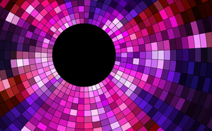
The Psychology of Colour & Marketing — What Actually Works?
How do the colour red or purple make you feel? Excited, sophisticated? Hunches behind the psychology of colour in marketing have been long-standing and intriguing, but are they actually true? Can you really use particular colours to enhance your customers’ moods, influence a click, establish brand recognition or affect their purchasing habits? Let’s find out.
Colour & Branding
In the article, “The Colour of Psychology of Colour in Marketing and Branding,” author Gregory Ciotti points out that there have been “numerous attempts to classify consumer response to different individual colours … but the truth of the matter is that colour is too dependent on personal experiences to be universally translated to specific feelings.” Gender, background, and cultural differences also need to be taken into account, as they have an influence on colour perception.
However, “In regards to the role that colour plays in branding,” Ciotti says, “results from studies, such as The Interactive Effects of Colours, show that the relationship between brands and colour hinges on the perceived appropriateness of the colour being used for the particular brand (in other words, does the colour “fit” what is being sold.)” Are you a funeral parlor and branding yourself with the colour pink? Pink stands out, but might not be appropriate for your business or the personality you want established for your brand.
Bottom line? Choose colours for your brand, website and emails based on the appropriateness, personality and emotions that you intend to portray. However, you also want to assess the competition and choose colours that make your brand stand out. According to KissMetrics, colour increases brand recognition by 80 percent, so differentiation is key for creating brand identity.
“It has been suggested in Colour Research & Application that it is of paramount importance for new brands to specifically target logo colours that ensure differentiation from entrenched competitors (if the competition all uses blue, you’ll stand out by using purple),” Ciotti says.
“It’s the feeling, mood, and image that your brand creates that play a role in persuasion,” Ciotti says. “Be sure to recognize that colours only come into play when they can be used to match a brand’s desired personality (i.e., the use of white to communicate Apple’s love of clean, simple design).”
Colour, Conversions & Design
Does green convert better than red? Can the colours you use in your email marketing or on your website really influence an action? Ciotti states, “… there is no single best colour for conversions. The psychological principle known as the Isolation Effect states that an item that ‘stands out like a sore thumb’ is more likely to be remembered. Research clearly shows that participants are able to recognize and recall an item far better (be it text or an image) when it blatantly sticks out from its surroundings.”
In an A/B split test, a red button on a website may result in more conversions than a blue one. Is red the magic colour? Does it evoke excitement and the desire to buy? Nope. Look at the website as a whole, the colour pallet used on the site, and any other images that may be competing with that button. If the website has a blue-based colour scheme and includes other blue images or elements, a blue button would easily blend in. The red button clearly stands out more due to the Isolation Effect. Bottom line? You can influence a reader’s action by guiding them with isolated colours. As you can see, we’re even using the concept on our own website.
Jared Christopherson of Yellowhammer suggests in his Mashable article, “10 Tips for Company Colour Schemes ” using the 60-30-10 rule when designing a website or email. “Choose three different colours and use them in the ratio of 60%, 30% and 10%. This rule provides a simple way to create a professional colour scheme for your brand.”
Once you have the 60-30-10 rule in place (background, base and accent colours), use the accent colour (the 10% and typically, your boldest colour) to guide customers to take a particular action. Use it in your call to action button, or on the link, tab, form you’d like customers to click next. But remember, using a bold button 10 times on the same page of your website or email defeats the purpose of “standing out.” You’ve now created ten competing actions. Don’t create too much competition. Decide what your most desired action is, and use your accent colours to accentuate that action. Is your entire website blue and gray? Make your accent colour and “Sign up now” button red or purple.